
Web Development
As end-users increasingly demand a more sophisticated communications experience tailored to meet their unique needs, putting them at center stage is what it will take to successfully compete.
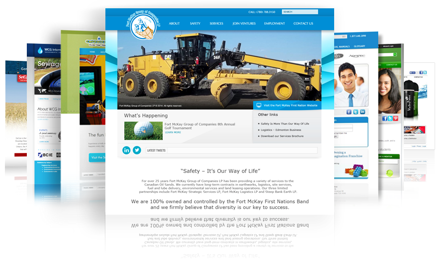
There's only 50 Milliseconds to make a good first impression...
A study carried out by a team of researchers at Carleton University in Canada, published in the journal Behaviour And Information Technology, has discovered that internet users judge the quality of a website and form an opinion in a matter of milliseconds. In the tests, subjects were exposed to websites for 500 milliseconds and then asked to comment on visual appeal and the relation to several design features.
They then used the same method with only a limited exposure of 50 milliseconds on another group. Bizarrely, the same conclusions were reached, indicating that users form an opinion as soon as the information and design hits the eye. First impressions obviously do last...
Responsive Website Design
Responsive Design is not the same as mobile design. Mobile design entails creating an entirely new website or web app with content specifically created for the mobile experience. Responsive Design, on the other hand, means that the same domain, the same content, and the same syntax — more or less manipulated by JavaScript and/or CSS3 Media Queries — respond to different viewports to provide the best user experience possible for each device. The different viewports include desktop monitors, laptops, tablets, and mobile devices and their corresponding orientations.
Free Consultation
Want to talk about your project?
We have the expertise. We have the time.
No Obligation Whatsoever
We’ve assembled one of the most creative and tech-savvy teams in Canada. We’re ready now to brainstorm your next project with you, at no cost to you.
You’ll be amazed at how much we can help during even a brief conversation.
Call us now at 613.823.4545